Case Studies

Real work, practical outcomes

A place for selected projects, decisions, improvements, and the systems behind the result.

Powered by Sidney Vega

Clear examples of strategy turning into structure

Case studies give each project room to show the problem, the approach, and what changed once the work was in place.

This page can grow into a library of websites, systems, support projects, creative builds, and community work as examples are ready to publish.

Sidney Vega

Case Study 01

HMC Generators Website Design & Homepage Header

A custom website and animated homepage header for HMC Generators, built to showcase standby generator services with a dramatic storm-ready visual style, clear navigation, service pages, product resources, financing pathways, and strong calls to action.

Visit HMCGenerators.com

This project was built for HMC Generators to create a bold, high-impact web presence for residential and commercial backup power services. The homepage header was designed as a cinematic storm scene with animated lightning, strong emergency-response messaging, and clear calls to action that immediately communicate reliability, urgency, and trust.

The website includes service pages, product catalog layouts, financing and assessment pathways, resource pages, contact forms, location maps, branded error handling, favicon support, and reusable visual assets. The design balances a dramatic storm-ready brand style with practical navigation and conversion-focused content, helping visitors quickly understand HMC's services and take the next step.

  • Cinematic storm-ready homepage header
  • Residential and commercial generator service paths
  • Location maps, forms, resources, and financing routes
  • Reusable branded assets and practical page structure
Case Study 02

West Ascension Parish Hospital Website & Community Resource Platform

A community-focused hospital website built to make local care easier to find, understand, and use, with clear service navigation, patient resources, contact pathways, emergency information, and a cafeteria menu experience that can turn meals into calendar reminders.

Visit WestAPH.org

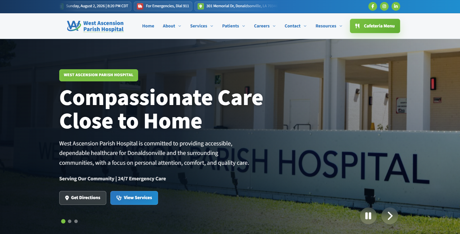
This project was built for West Ascension Parish Hospital to support its role as a dependable community resource for Donaldsonville and the surrounding area. The site presents the hospital with a calm, accessible, and service-focused design that helps visitors quickly find directions, care information, resources, department details, and the next practical step.

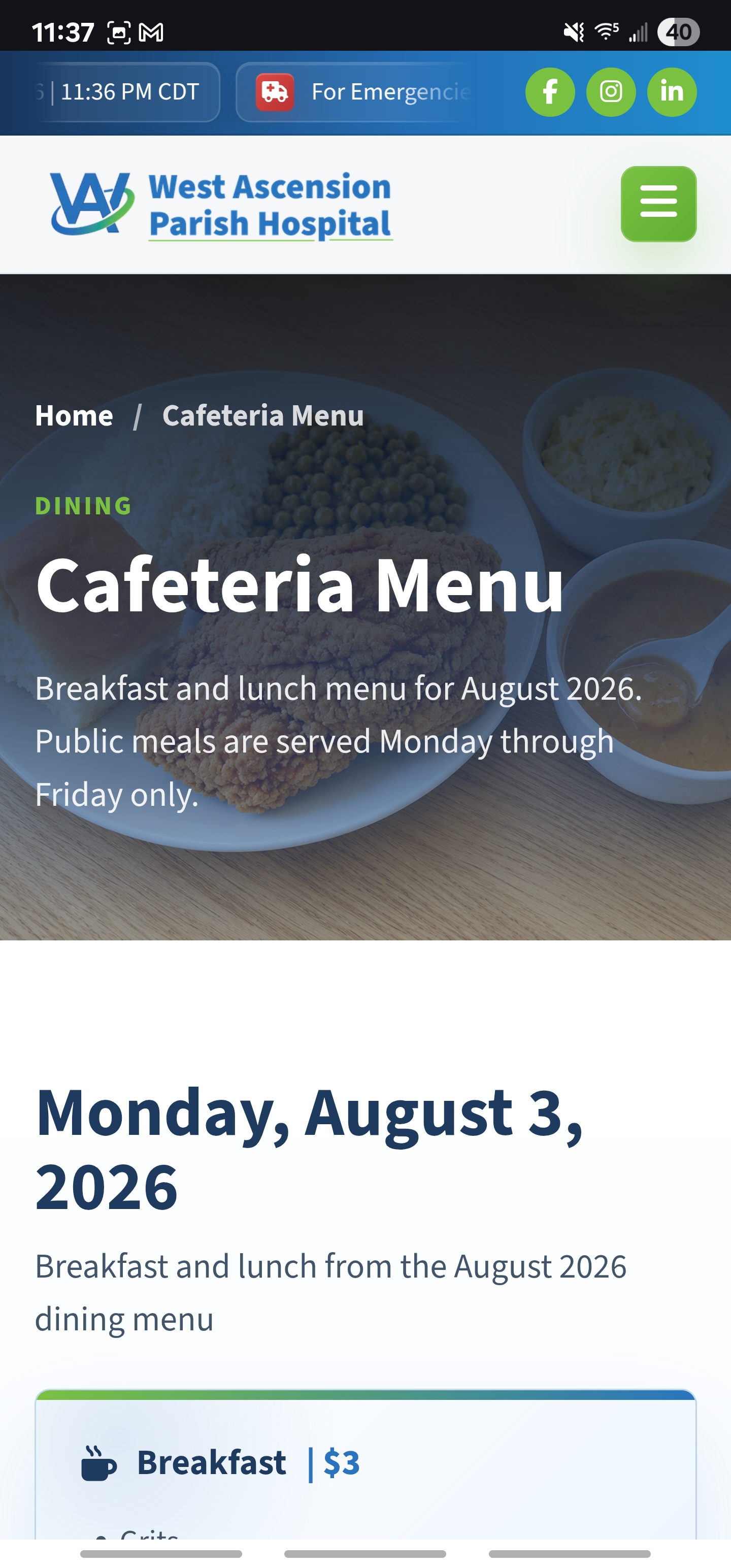
The website includes a responsive homepage experience, clear patient and service pathways, contact and location information, resource navigation, social links, and a dedicated cafeteria menu. The cafeteria menu was designed with calendar-event support so people can add meal reminders and plan a visit to the cafe when something on the menu fits their day.

The work balances trust, local familiarity, and usability. For a hospital, the website is not just a digital brochure; it is part of how the community understands what help is available, how to reach it, and how everyday services can stay connected to real people.

  • Community healthcare presence with clear local access
  • Cafeteria menu with calendar reminder support
  • Directions, emergency information, and contact pathways
  • Responsive desktop and mobile homepage experience
West Ascension Parish Hospital homepage desktop design
West Ascension Parish Hospital homepage mobile design

Case Study 03

Ascension Credit Union Website Redesign & Member Resource Platform

A modern, responsive credit union website rebuilt to help members find services, compare options, and take action across loans, accounts, digital banking, calculators, branches, appointments, and member resources.

Visit AscensionCU.org

I redesigned and rebuilt the Ascension Credit Union website into a modern, responsive digital experience that makes it easier for members to find services, compare options, and take action. The project focused on turning a content-heavy financial website into a cleaner, more organized platform with clear pathways for loans, accounts, online banking, calculators, branch information, appointments, and member resources.

The site was built around practical user journeys: applying for a loan, becoming a member, checking rates, finding a nearby branch, scheduling an appointment, exploring mobile banking tools, and learning more about financial products. Each page was structured to feel approachable while still supporting the trust, clarity, and compliance expectations of a credit union website.

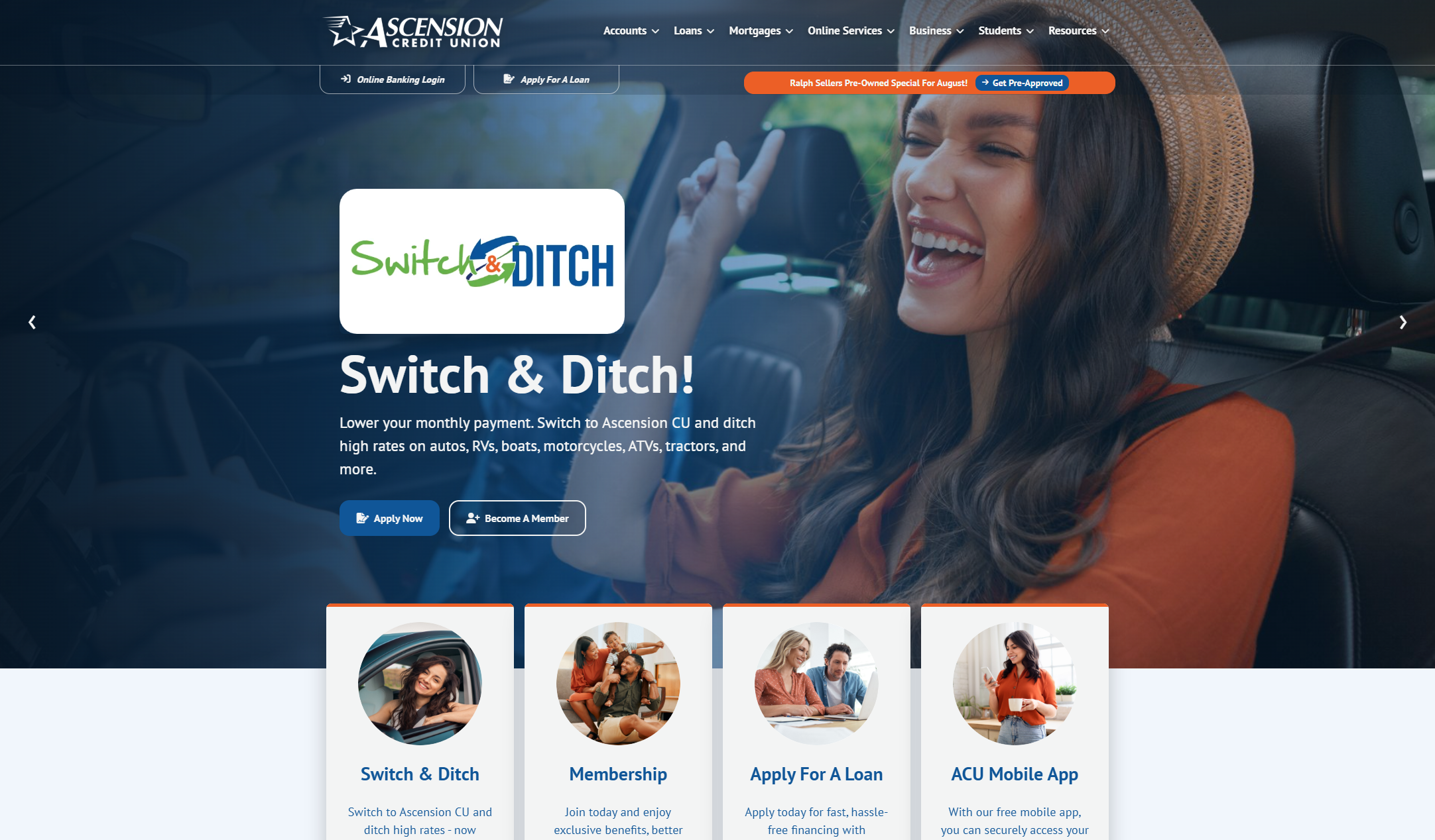
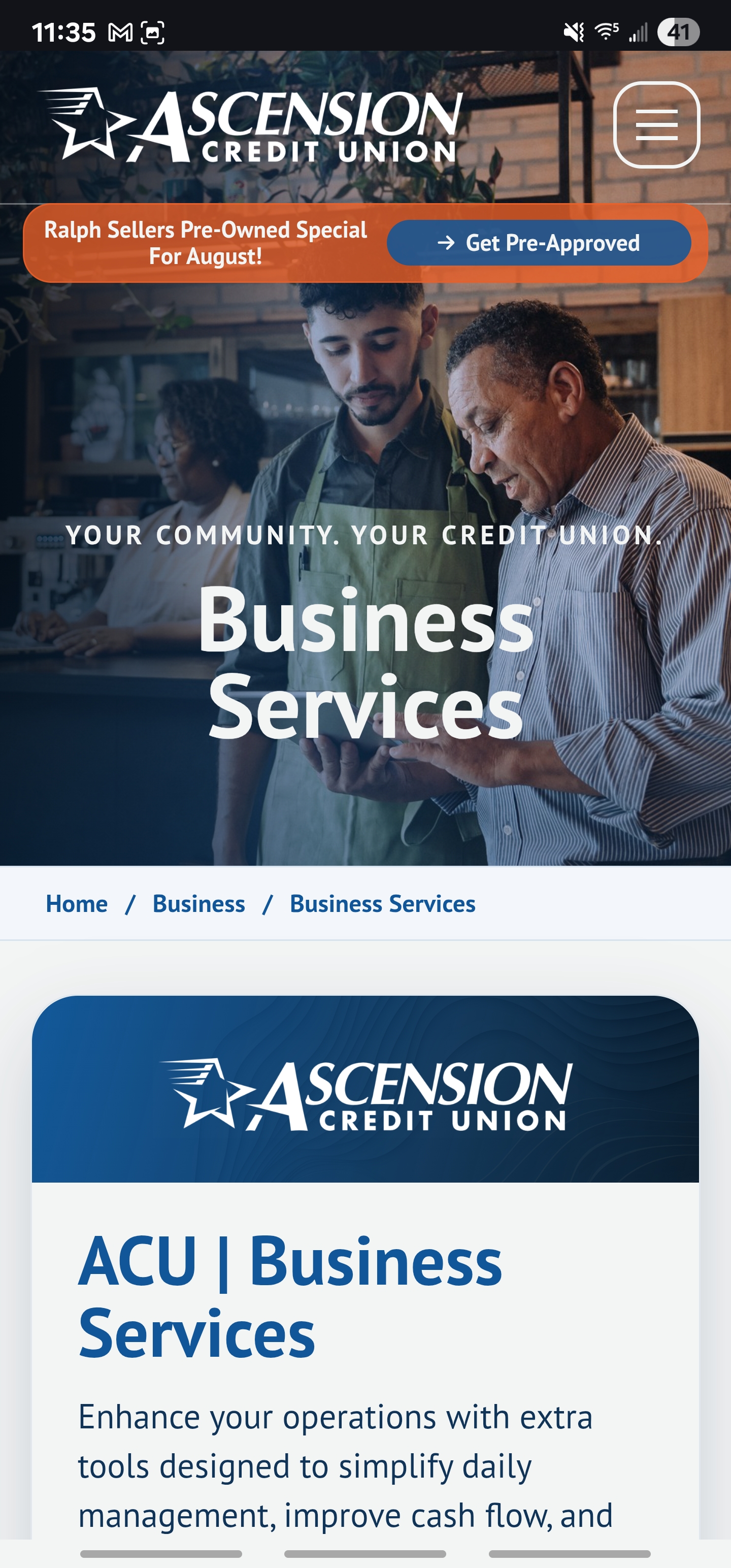
Key features include a redesigned homepage with promotional hero carousel and quick action links, organized navigation for accounts, loans, mortgages, online services, business products, student resources, and support pages, plus dedicated pages for auto loans, personal loans, credit cards, mortgages, HELOCs, student accounts, business services, and more.

The final website gives Ascension Credit Union a stronger digital presence that feels friendly, trustworthy, and easier to navigate. By organizing services around real member needs and adding direct calls to action throughout the site, the redesign helps users move from browsing to applying, scheduling, contacting, or learning with less friction.

  • Responsive multi-page website for desktop and mobile members
  • Clear member journeys for loans, accounts, online banking, rates, branches, and appointments
  • Financial calculator section for auto, mortgage, personal loan, credit card payoff, CD, savings goal, and HELOC planning
  • Mobile banking, app downloads, campaign content, feedback, newsletter, and reusable page systems
Ascension Credit Union website desktop homepage design
Ascension Credit Union website mobile business services page design

Case Study 04

K Rome Art Website & Gallery Platform

A full-screen photography website for KROME.ART built to present Kyle Rome's Southern visual archive with immersive homepage imagery, gallery and exhibition paths, shopping support, and a quiet brand voice rooted in presence, memory, and place.

Visit KROME.ART

This project was built for Kyle Rome's Photography to give KROME.ART a digital home that feels like the work itself: still, Southern, textured, and intentional. Kyle signs his work K.Rome '25, marking not just the year the shutter clicked, but the moment the image meant something.

The site centers a full-screen homepage experience, restrained navigation, immersive photography, exhibition pathways, and shopping tools so visitors can discover the work, understand the artist, and move from viewing to collecting without losing the atmosphere of the gallery.

The result is a living archive of the South: its quiet water, cypress knees, porch birds, old sanctuaries, long roads, beauty, bruises, and boldness, presented with enough structure to support exhibitions, sales, contact, and future collections.

  • Full-screen image-led homepage experience
  • Gallery and exhibition presentation paths
  • Shopping support for collectible photography
  • Artist story, photography archive, and brand presence
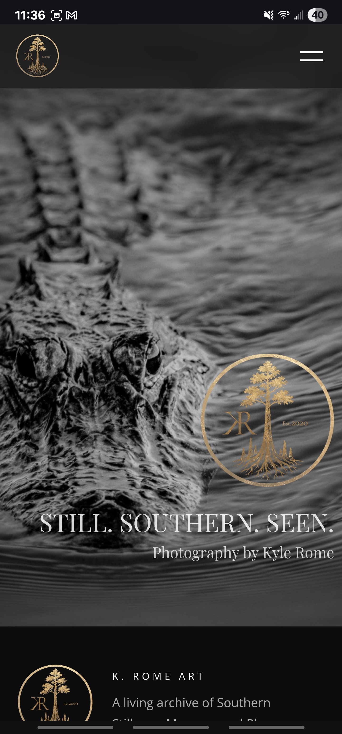
KROME.ART full-screen photography homepage on desktop
KROME.ART mobile navigation and photography homepage

Case Study 05

Reach New HERizons Website & Retreat Landing Page

Empowering women. Strengthening communities. Building futures. A one-page event website for MBECA Small Business Center's women's wellness, leadership, and business retreat.

View New Herizons Website

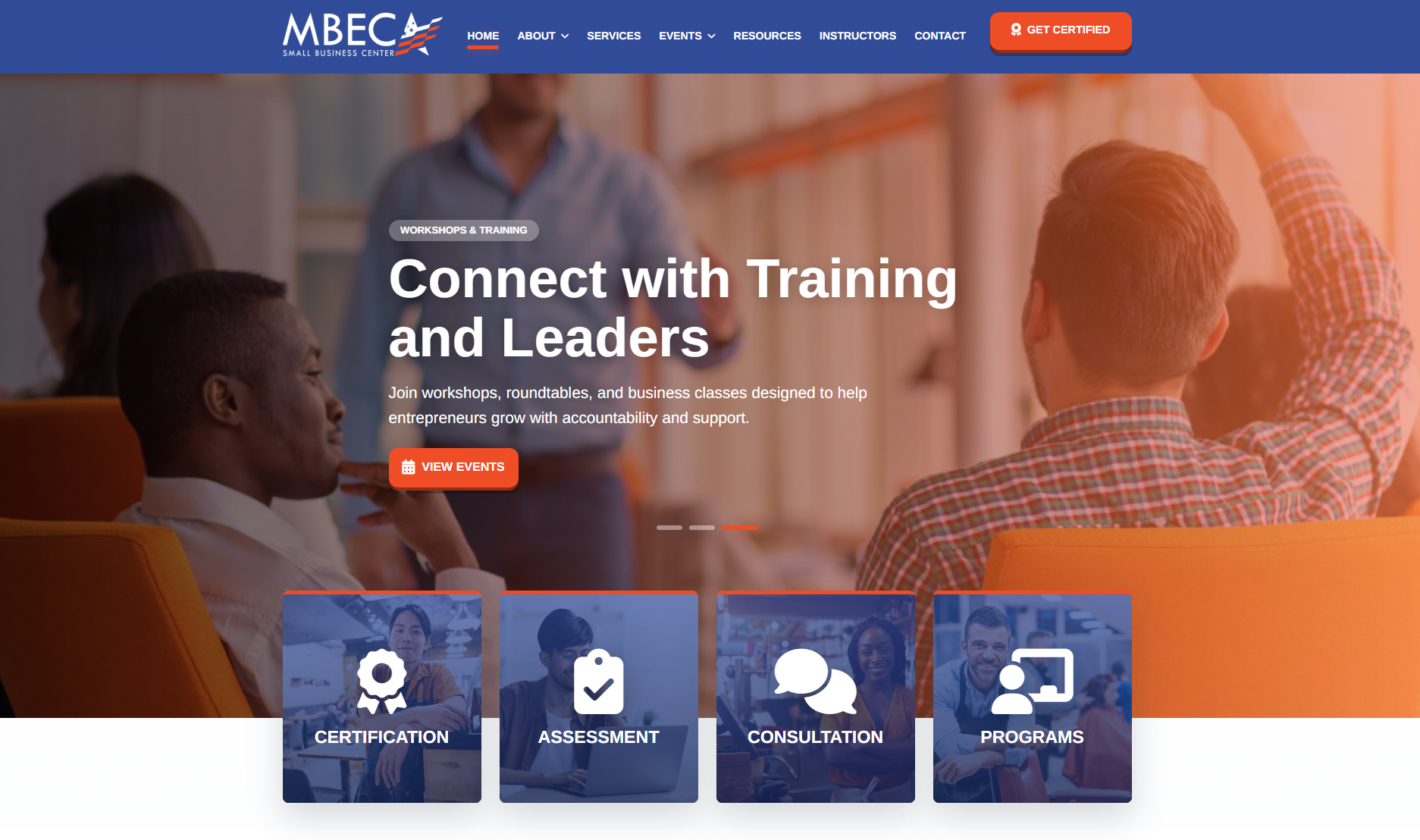
Reach New HERizons was created as a polished, mobile-friendly event website for MBECA Small Business Center's women's wellness, leadership, and business retreat. The goal was to clearly communicate the event's purpose, schedule, registration details, community impact, and shareable resources in one cohesive landing page.

The site uses the event's existing visual assets, including branded logos, promotional posters, council graphics, and program materials, to create a refined digital presence. The design balances elegance and clarity with a purple, gold, teal, and magenta palette, editorial-style headings, and clean readable body copy.

Key features include a responsive hero section, event agenda with Google Calendar and ICS download links, registration call-to-action with QR code access, lightbox poster previews, an Influential Women's Council section, Young Influential Women's Academy content, downloadable share kit assets, supporter logo placement, and a branded thank-you page for post-registration confirmation.

The final result is a flexible event landing page that feels professional, inviting, and easy to navigate across desktop and mobile. It gives attendees a clear path to register while supporting outreach, sponsorship visibility, and long-term community storytelling.

  • Wellness Village rotations across mind, body, spirit, family, health, beauty, finance, leadership, and business
  • Expert consultations and leadership forum content for practical one-on-one guidance
  • Agenda tools with Google Calendar links, ICS downloads, QR registration, and share resources
  • Chef wellness luncheon, nutrition resources, and community-centered event storytelling
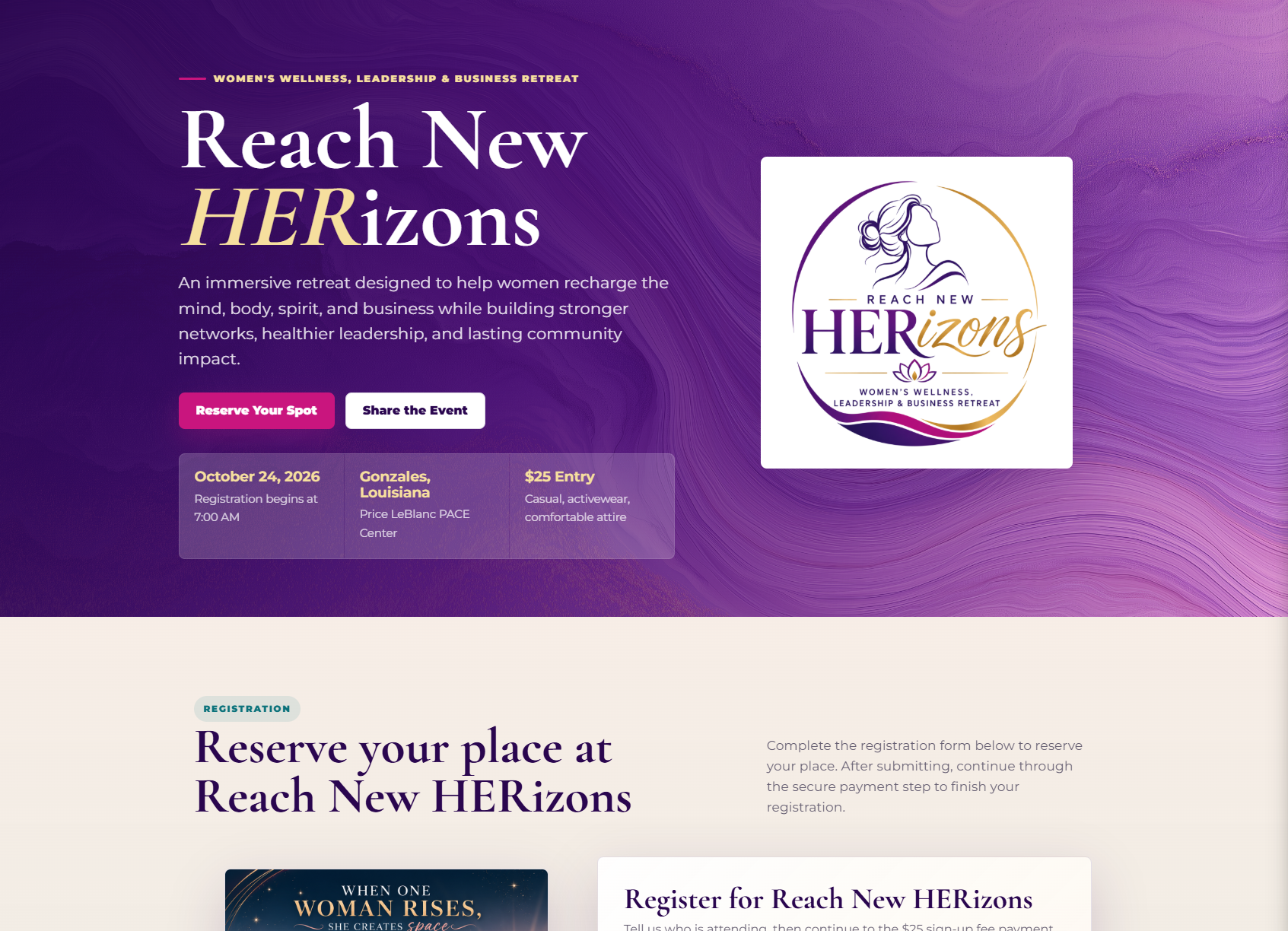
Reach New HERizons website desktop design
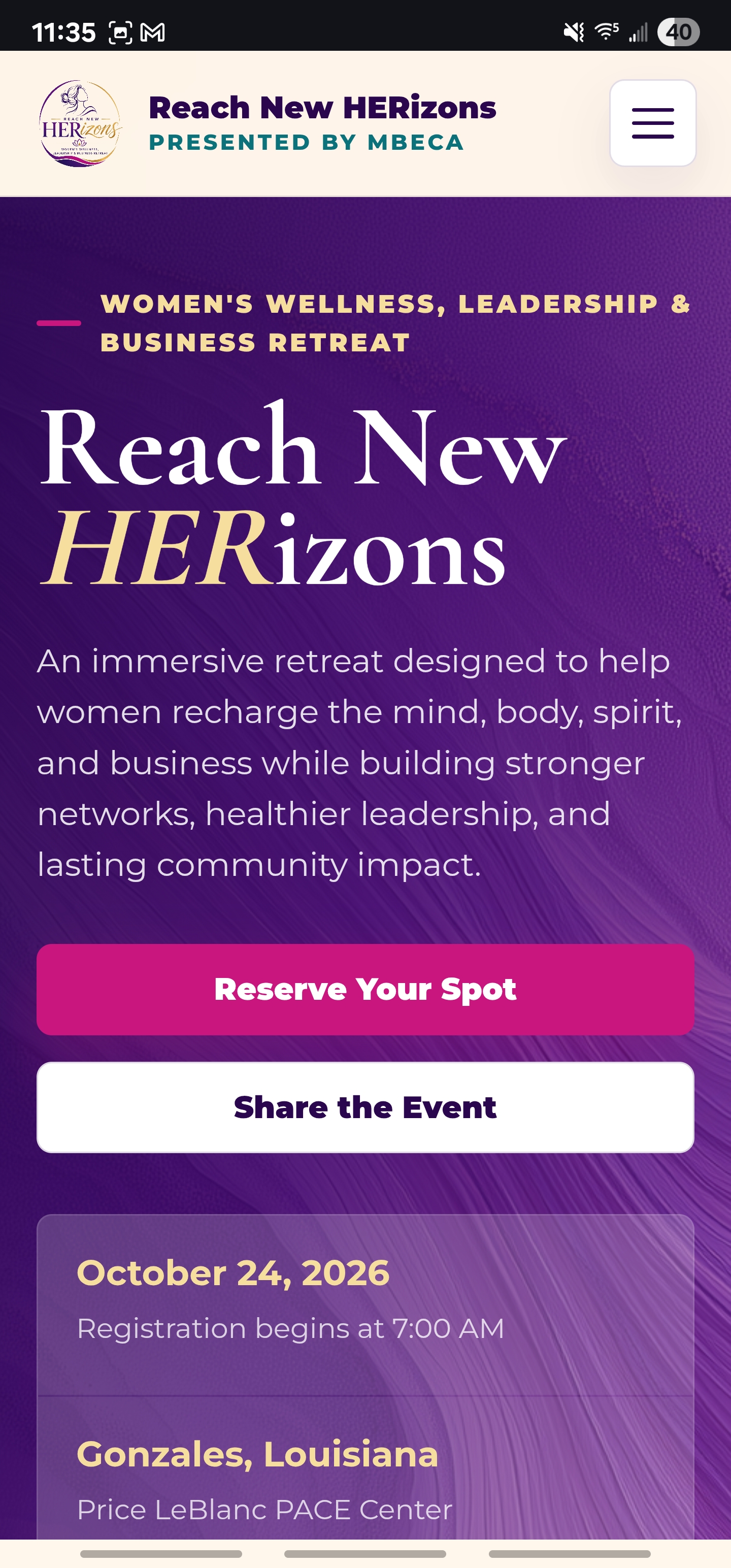
Reach New HERizons website mobile design

Case Study 06

Sidney Vega Website & Business Systems Platform

A custom website for Sidney Vega, LLC built to connect services, support, creative work, case studies, resources, blog articles, QR campaign pages, and practical calls to action into one clear digital home base.

Visit SidneyVega.com

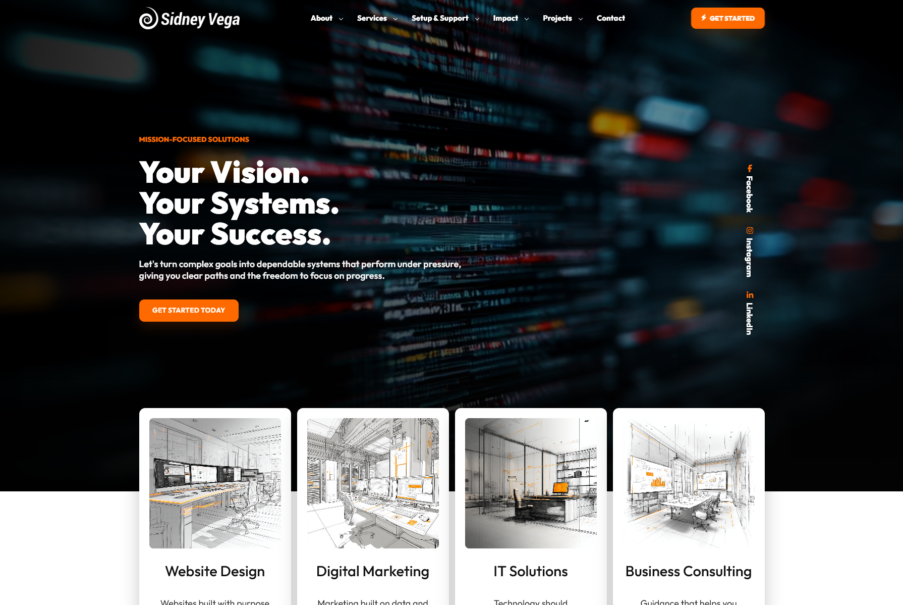
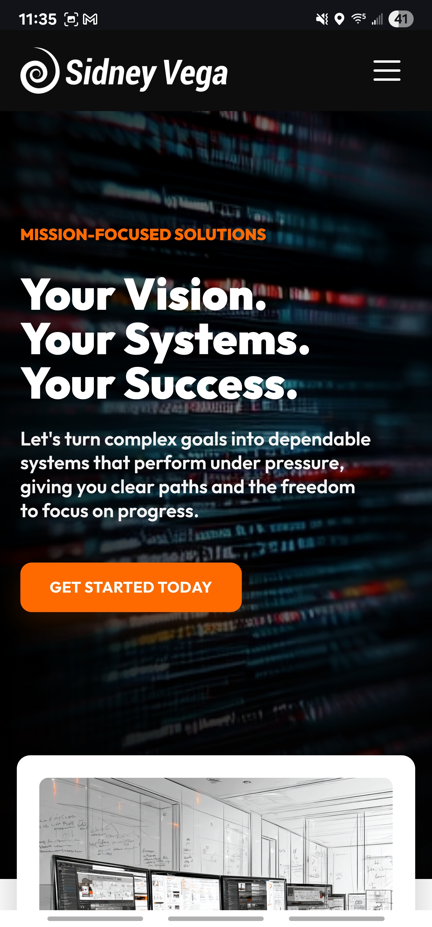
This project is the working home base for Sidney Vega, LLC: a public website, service directory, portfolio, resource hub, blog, and practical systems showcase in one place. The design uses strong contrast, orange action cues, clear navigation, and focused page structures to help visitors understand the work quickly and move toward the right next step.

The site includes service pages, support pathways, project galleries, case studies, digital empowerment resources, scam prevention content, blog articles, QR landing pages, sitemap shortcuts, contact routes, analytics support, and reusable visual systems. It is built to grow as the company grows while keeping the experience organized and easy to maintain.

The purpose is simple: turn a broad range of creative, technical, and operational work into a site that feels coherent. It gives people a clear sense of what the company does, how the pieces connect, and where to begin.

  • Connected service, support, project, and resource structure
  • Brand voice, writing, visuals, and case study presentation
  • QR campaign landing pages and practical sharing paths
  • Analytics-ready pages and ongoing growth structure
Sidney Vega website homepage design
Sidney Vega website mobile homepage design

Digital Marketing

Need the work to keep reaching people after launch?

Turn a strong website into clearer campaigns, useful content, and visibility that helps customers know what to do next.

Explore Digital Marketing

Use this when your site is live, but the message, audience, content, or follow-up needs a more consistent path.